


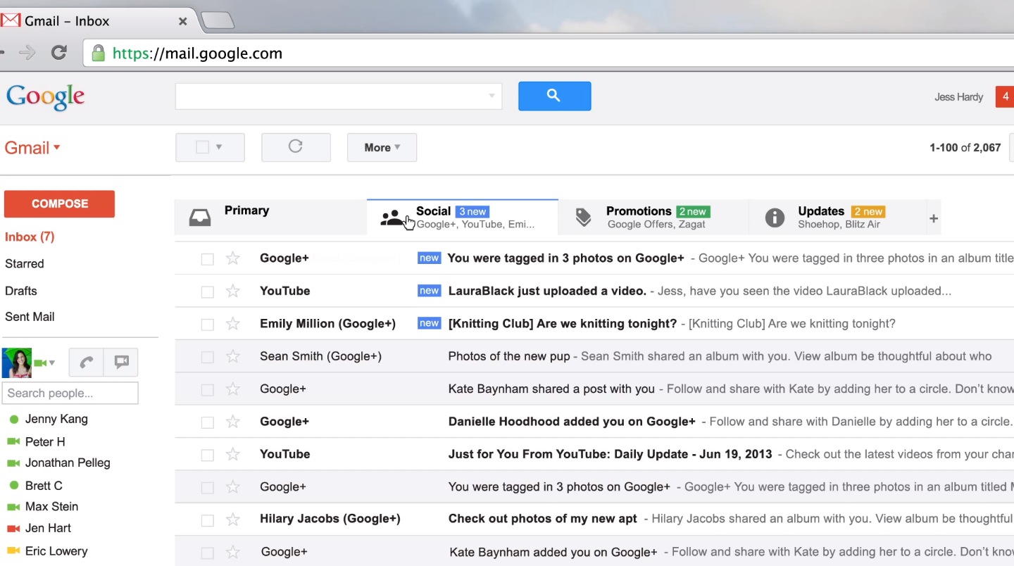
If you’re a Gmail user, you surely have noticed the changes in the user interface of this email service. First, there was a change in the composition window a few months ago and then last may they announced that they will be rolling out a new interface on both the desktop version and mobile app. My PC version was updated Thursday and my mobile version was updated last Saturday. I was a bit surprised by the new look when I accessed my desktop version last Friday. There are three default tabs showing when I opened my email. There’s the “primary tab” , the “social tab” and “promotions”. After the promotion tab there is a plus sign showing. You can add another tab and a category when you click on it. You can check on “updates” and “forum” to further organize your email and greatly reducing Inbox clutter in the process.
The New Options
Google describes the new tabs as a way of putting back users in control to see what’s new at a glance and decide which emails you want to read and when you want to read it. The tabs will automatically sort the Inbox into these tabs using their special algorithm. Let’s describe the tabs so that you can fully understand its use:
1. Primary. This is the person to person messages and conversation that don’t show in the other tabs. You can also prefer to force starred emails from all the tabs to show in the Primary tab.
2. Social. These tabs will contain all the messages from social networks, online services, media-sharing sites and other social websites.
3. Promotions. It contains marketing emails, offers and deals from marketing websites.
4. Updates. It will contain personal and auto generated updates that include billing, statements, receipts, bills and confirmations.
5. Forums. This tab will contain messages from your discussion boards, mailing list and online groups.
Enabling The Tabs And How To Use It
If your in box is not yet set up with the new interface, you just have to click on the settings icon on the upper right hand side and select the “configure Inbox“ option. After clicking on it, Gmail will automatically sort your Inbox. You can also drag and drop emails from one tab to the next. When you try to drag an email to another tab, Gmail will ask you if you want to create a filter for that particular sender to send future message form said sender to that tab. However, any existing tab cannot be moved into that tab. You can also create your own filters to send email to the specific tabs that you have activated.
Customizing The Tabs With Your Own Filter
Before making the filter, you have to make sure it will not overlap with an existing filter that may negate or counteract what you’re trying to change. You can customize the tabs by doing these steps:
1. Create a new filter for the emails that you want to move to one of the tabs.
2. On the next screen, choose filter options and then choose a category that will match the tab for the “categorize as” option.
3. Check on the “exclude form SmartLabels” in case Gmail tries to categorize your messages differently. After that, click on “create filter”.
4. If you don’t want Gmail to automatically categorize the other messages on your tab, you need to go to Settings>Filters and scroll to the bottom of the Smart Label Filters and then disable the filter.
You Can Disable The Tabs If You Don’t Like It
One good thing about Google is that they have the option to go back to the original or old interface. If you’re not happy with the new user interface this is what you need to do - click on the setting icon in the upper right hand corner, click on the “configure Inbox” and then uncheck everything except for the “primary” option. This will take out all the tabs and will bring you back to the old interface.
The new look may confuse you at first. It happened to me. For now, I find it helpful because my Inbox looks and feel cleaner compared to the old one. This will work out well with content management system users because important updates , communication and email that are related in their CMS management will be in order, streamlined and uncomplicated. Now this is just a first impression and time will tell if the new look will stand the test of time or the ever changing moods of the users. Have you tried the new UI? Tell us what you think.